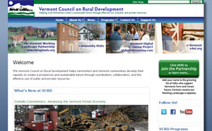
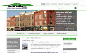
Maybe you’ve noticed, but our website just got an overhaul.


The old VCRD home page vs the new VCRD home page
Throughout the Vermont Digital Economy Project, we have been working with nonprofits and small Vermont businesses to help them to take advantage of online tools, and to present themselves professionally and effectively online. One of the biggest impressions that an organization can make is with its website. Just like the experience a shopper has when he walks into a store, when a user lands on a website, she immediately develops an impression of the type of organization she is looking at. Show an outdated site, and you might be leaving the impression that you’re an aging organization who is probably not particularly forward-thinking. When we looked at the VCRD website, therefore, there were a number of considerations that we took into account as we decided to make this switchover to an updated site, not all of which were just about the design:
1. Technology advances:
As with any technology, the technology that is involved in building websites and maintaining the Internet changes with rapid frequency. When I first started working on websites, I was hard coding in HTML tables (which created a lot of extra “noise” around the content from a back-end perspective). Others were creating whole websites out of Flash, which meant that in order to view the site, a user had to have installed an Adobe Flash plugin, and that nobody could link to a specific page within the site. Both of these methods created sites that were also not easily searched, and therefore did not appear well in search engine rankings.
Now, web developers usually work within either open-source or proprietary Content Management systems, and code pages using HTML5, CSS, and, sometimes, Javascript where necessary. These advances have allowed for more functionality, and sites that look slicker and work more smoothly.
In 2010, VCRD switched from hosting our site with a proprietary content management system to Drupal 6, an open-source platform that allowed for a lot of customization. But since then, Drupal has come out with to version 7, and Drupal 8 is being developed. In order to keep our site running smoothly, and to conform to the latest web standards, from a technological perspective, we had to update.
2. Businesses and organizations grow and change:
The Vermont Council on Rural Development works on a variety of programs, facilitations and summits, and the Vermont Digital Economy Project is just one portion of VCRD’s overall work. In the 22 years since VCRD was founded, we have created, added to, and finished a number of programs that the structure of our old website didn’t allow for. There was a multitude of content on the site, but the original organizational structure of the site meant that much of this content was hidden, and difficult to find.
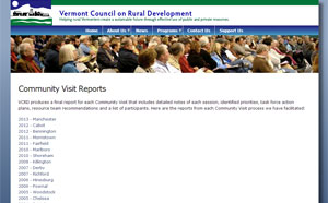
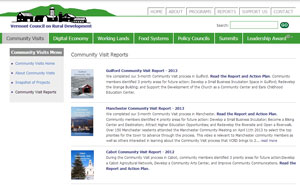
For instance, over the years, VCRD has created and published a number of reports. For example, every time a community visit is complete, a final report is created. Summits and facilitated discussions usually generate a final report as well. These reports give a great snapshot into the detailed and intricate work of VCRD, and contain outstanding information for anyone researching a similar topic, but on the old site, a user would not have been able to easily find them. Now, we have a reports list, where users are encouraged to filter the list based on what they are interested in.


The old VCRD Community Visit Reports page vs the new VCRD Community Visit Reports page
We’ve also redesigned our navigation. Whereas before, the navigation bar would vary depending on what program a user was looking at, in our current design, the top navigation always remains constant, while sub-menus and side-menus help users to determine their location within the overall structure of the site.
Overall, when we discussed the creation of the new site, we looked at who we were now, and organized the new site’s structure around this model.
3. Styles change:
Just as with clothing, cars, and architecture, what is “in-style” for web design changes as people adapt, grow, and use the web differently. For example, around 1999, 3D “pop-out” buttons were nearly ubiquitous across sites, but now, the trend is towards flat and thin designs. (There are some great examples of web design through the years, including a good description of its evolution in this article.) Part of new design trends is also driven by the predominance of smartphones and tablets, which use vastly different screen sizes and resolutions. This means that responsive design has become key, and designing a site that will work on multiple types of screens is very important.
When designing and implementing our updated site, therefore, we took into account new technologies, organizational content and structure, and finally, a design that could accommodate our information and hopefully date well within current design trends.
We hope you like it!
