Part of the matching funds for our grant was graciously donated by IBM, which, through its Impact Grants program, allows expert consultants to conduct in-depth analysis and workshops with nonprofits on a number of important topics. In the past, these IBM consultants have helped the Vermont Access Network and the Vermont Foodbank with Disaster Preparedness plans, and the Vermont Libraries with their Social Media Strategy. This past Thursday, IBM’s consultants were back to help Vermont 211 develop a User Experience strategy for the new website they are in the process of building.
There are a number of different aspects to building a new site, not least of which is the way it will end up looking, but one of the most important first steps to building or updating any website is to consider the user’s experience. User Experience (UX) is different from User Interface (UI: the way a site looks) in that it’s about how a user navigates through a website to find what she is looking for. The actual site could look ugly, but as long as a user is able to get the result she was expecting in a simple and easy-to-understand way, her overall experience on the site will most likely remain positive.
Saeideh Joodaki, a Senior User Experience Designer at IBM, described it this way: “User Experience is the way a person feels about using a product or software,” she said. A good user experience means that a user can interact with a product without a manual, and can find everything he is looking for. One example of bad UX, Saeideh explained, is a TV remote control that looks like the remote pictured to the left. There are so many buttons that it is difficult to know which one to press for what, and its manual is usually about the size of a novel.
If a user is able to easily navigate a product or a website, then he comes away feeling comfortable with the product or site. A good user experience also creates more trust in the overall brand. “A positive user experience creates brand loyalty,” explained Saeideh, “if you have a positive experience, then it’s more likely that you will go back again to that product or website. If you have a negative experience, you might never go back to that service and will probably tell your friends not to use it as well.”
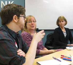
 Vermont 211 staff members Ian Sherman, Mary-Ellen Mendl, and Carmel Quinn discuss the Vermont 211 website.
Because each product, service, or website is created for a specific purpose, there is no standard for creating a positive user experience. “The only thing that is standard,” said Saeideh, “is that you have to have a very good understanding of who your users are and what their needs are.”
Vermont 211 is a program of the United Ways of Vermont that aims to meet the needs of anybody who calls 2-1-1. They offer referrals to services for everything from healthcare to childcare to emergency food and shelter. “Vermont 211 is not just for people who can’t pay their rent, or who have an issue,” said Mary-Ellen Mendl, Director of Vermont 211, “it’s really the community’s telephone number.”
Because anybody can dial 2-1-1 and speak to someone 24/7 with any question, the staff who attended this IBM UX workshop found the process of developing a targeted user audience to be a difficult task. They emphasized that they wanted their services to be available to everyone in Vermont. Carmel Quinn, the Program and Resource Manager, said she wanted the website to be “a viable option to agencies who are working with clients so that they can easily access information,” and Sue Reardon a call-center volunteer with Vermont 211 noted that the site needed to appeal to a broad variety of ages, from teenagers who might be calling with questions about issues like suicidal thoughts and eating disorders, to aging populations who may not have access to high-speed Internet.
Everyone did agree on one thing, however. The website is not a replacement to picking up the phone and making a call to 2-1-1. Ian Sherman, Information & Referral Specialist/Media Coordinator, explained that he wanted the website to “be a counterpoint to what we do on the phone. The site should be a place for people to know what’s out there and have some base knowledge before they make the call,” he said. Mary-Ellen agreed. “The site should be an alternate place for people to go, but not to necessarily replace the phone, because we have trained call specialists to assess and dig deep into issues,” she said.
Karen Kersting, the Creative Director for IBM Interactive, distilled this information into a main theme for the site. What she was hearing, she said, was that one goal for the site is to make it compassionate. The Vermont 211 staff agreed.
Later in the day, a persona-building exercise helped build clarity around specific types of users, both those who the website and call center were already attracting, and those who the organization would like to attract. Members of Vermont 211 created profiles for three users: the mother of a fairly affluent family, a teenage student, and a community-worker.
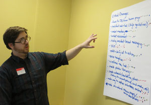
 Ian Sherman, Information & Referral Specialist/Media Coordinator for Vermont 211, walks through some of the action items that the staff identified through the day-long workshop.
Through a comprehensive day of planning and analysis, the staff of Vermont 211 was able to develop a list of tasks that they can immediately start working through to improve their website. One very important aspect of User Experience Design is the site’s navigation, and with Saeideh’s analysis and suggestions, Vermont 211 now has a good foundation around which they can work to structure their new site. Other tasks included creating informational pages on some of the most sought-after resources, working to create consistent branding guidelines and messaging, and starting to work on improving the website’s SEO (Search Engine Optimization).
The two IBM consultants, Karen and Saeideh, will synthesize all of the information and discussion they heard on Thursday into a comprehensive site plan, which they will present in a few weeks. As Karen explained, “really this workshop is about an assessment. We use it to generate new ideas and be creative, and figure out what are the tasks that are at hand.”
In the meantime, Vermont 211 has some immediate actions that they can take to start to work towards a stronger, more user-friendly site.
