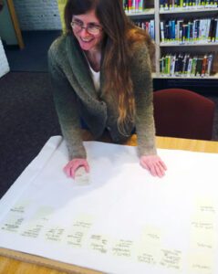
Amy Grasmick, director of the Kimball Public Library, uses card-sorting to help create the navigation for the library’s new website.
There is a term that developers refer to when building websites called usability. The basic premise involves creating websites that are easy to navigate, as well as being full of useful information and having a “pretty” look and feel. After all, even if you have a beautiful looking website with rich content, if the site is not organized well, visitors will have trouble finding the information they need, and you may leave them with a negative impression of your organization. It is important, therefore, to design a new website with the audience that the website is intending to reach in mind.
Moving ahead with a website overhaul before you understand your audience is an easy trap to fall into. An organization that I am an advising in my capacity as the Nonprofit Advisor for the Vermont Digital Economy Project, the Kimball Public Library, in Randolph, VT, is in the early stages of creating a new website. Through my work with them, it soon it became evident that they were in danger of creating a site for themselves instead of for their patrons.
According to Amy Grasmick, director of the Kimball Public Library, “Librarians should ask our users what they want. But, do we? It’s faster and easier to just do things the way we, as librarians, think they should be done. And, that is basically the approach I took when I started looking at our website redesign. Staff and I talked about what we want to present on the website, and the ‘logical’ (to us, as professional information organizers) categories to create. We did at least acknowledge that, since we work inside the profession, it’s hard for us to get in the mindset of folks who aren’t librarians, and to create a website that serves them. We talked about names – e-resources? online resources? We talked about plain English v. lingo – borrow a book from another library? Inter-library loan? ILL? But, we still came up with the categories ourselves, and that made me uncomfortable.”
To address this discomfort, I suggested that she use a process known as card sorting to gain a better understanding of what navigation structure and word choice would resonate best with library patrons. Here is how the process worked: Amy wrote a description of the services and other content she wanted to include on the website on individual post-it notes. Each post-it symbolized a finished page that she wanted to see on the site. She then asked library staff and the library’s internet intern to categorize the pages and name each of the categories they had created. Amy’s next step will be to ask volunteers and patrons at the library to perform the same exercise. Through this process, Amy will be able to get input from both librarians and patrons, in order to come up with an intuitive navigational scheme and site structure for the Kimball Public Library’s website.
So far, Amy has been happy with the results of her card sorting exercise. When Amy asked the library’s Internet Intern to go through the process, “she came up with a remarkably similar arrangement” to what the librarians had created, which according to Amy, “means that either we are just that good, or that we are all familiar with the way library websites are generally arranged, or something else. It will certainly be worthwhile to ask a group of people – perhaps our volunteers – to go through the same exercise, and see what shakes out. Even if everyone has a different opinion about the design, I have no doubt that the folks we ask will contribute to a better end product, because they will think of things the pros (that’s us) don’t!”
While Amy and the other librarians at Kimball are using the card sorting process with post-it notes, notecards are also a good option. And for those who are more technologically inclined, online versions of this exercise also exist, such as at Concept Codify. The key is to use an arrangement that makes the most sense for your organization.
The example of the Kimball Public Library is a great reminder that whenever you are creating a new website, it is important to ensure that there’s input from your various audiences. This extends beyond site navigation, to determining the photos, content, and even your site’s domain name. Be sure to take the time to review your organization’s goals and develop a clear idea of who would visit your site and why they would do so.
